Ever wondered why certain brands instantly make you feel a specific way? Why does a luxury brand often gravitate towards deep blues and silvers, while a fast-food chain might lean heavily on reds and yellows? It’s not just a designer’s whim – it’s often the calculated application of color psychology in branding.
Colors are more than just aesthetic choices; they are powerful, non-verbal communicators that can evoke emotions, influence perceptions, and even drive purchasing decisions. Understanding how different hues impact your audience is an essential tool in your branding arsenal.
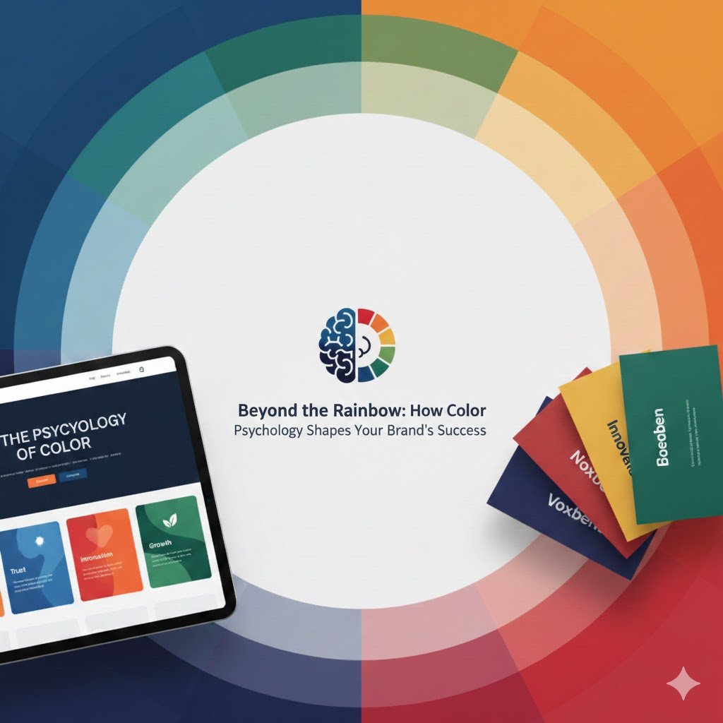
The Emotional Spectrum: What Do Colors Say?
Each color carries a unique psychological weight, often varying slightly across cultures but generally holding common associations:
-
Red: Energy, Passion, Urgency. Think Coca-Cola, Netflix. Red demands attention and can signify excitement, danger, or love. It’s often used by brands wanting to create a sense of urgency or high energy.
-
Blue: Trust, Serenity, Reliability. Facebook, PayPal, many financial institutions. Blue is a calming color often associated with stability, intelligence, and professionalism. It’s excellent for brands aiming to build trust and authority.
-
Yellow: Optimism, Warmth, Happiness. McDonald’s, IKEA. Yellow is bright and cheerful, often associated with youth and positivity. It can grab attention but overuse might suggest caution.
-
Green: Growth, Nature, Health, Wealth. Starbucks, Whole Foods Market. Green represents freshness, tranquility, and often eco-friendliness. It’s popular with health, wellness, and environmental brands.
-
Orange: Enthusiasm, Creativity, Friendliness. Nickelodeon, Amazon. A vibrant and energetic color, orange is often seen as playful and modern. It can inspire creativity and action.
-
Purple: Luxury, Royalty, Wisdom. Hallmark, Cadbury. Historically associated with royalty, purple conveys sophistication, creativity, and uniqueness. It’s often used by brands targeting a high-end market.
-
Black: Sophistication, Power, Mystery. Chanel, Apple (for some products). Black is classic, elegant, and timeless. It exudes power and authority but can also feel intimidating or heavy if not balanced.
-
White: Purity, Simplicity, Cleanliness. Apple, many healthcare brands. White signifies minimalism, clarity, and freshness. It often acts as a background to allow other colors or content to stand out.
Applying Color Psychology to Your Brand
Now that you know the basics, how do you put this into practice?
-
Define Your Brand Personality: Before choosing colors, clearly articulate what your brand stands for. Is it playful and innovative, or serious and reliable? Your colors should reflect this core identity.
-
Understand Your Target Audience: Who are you trying to reach? Different demographics and cultural backgrounds might respond to colors differently.
-
Research Your Competitors: While you want to stand out, knowing what colors your competitors use can inform your choices – perhaps you want to differentiate, or perhaps you want to align with industry expectations.
-
Consider Your Medium: Colors can look different on screen versus in print. Always test your palette across all intended applications.
-
Less is Often More (But Don’t Be Afraid to Experiment): A primary brand color supported by a few secondary and accent colors usually works best. Overloading with too many colors can lead to a chaotic and inconsistent look.
Case Studies in Color
-
McDonald’s (Red & Yellow): High energy, urgency, warmth. Appeals to families and children, encouraging quick decisions and happiness.
-
Starbucks (Green): Nature, freshness, tranquility. Reflects their focus on natural ingredients and a relaxed coffee experience.
-
Tiffany & Co. (Tiffany Blue): A proprietary color that instantly signifies luxury, elegance, and exclusivity.
The Takeaway
Color is a silent salesperson, a powerful emotional trigger, and a foundational element of your brand’s visual identity. By thoughtfully selecting and applying color, you can craft a brand image that not only looks good but also effectively communicates your values, resonates with your audience, and ultimately contributes to your business success.
Don’t just pick a pretty color; choose colors that tell your brand’s story.