Gemini_Generated_Image_7vmm297vmm297vmm

The Art of Saying More with Less: Why Minimalism Dominates Modern Marketing

In an era of “information overload,” our brains have developed a filter. We scan, we don’t read. We glance, we don’t stare. For a brand, this means you have approximately 1.2 seconds to make an impression. This is exactly why the world’s most successful brands—from Apple to Nike—have stripped away the clutter.

1. Clarity Over Complexity

When you reduce your design to its bare essentials, you remove the “noise.” A minimalist logo or ad layout tells the customer exactly where to look. In marketing, clarity equals trust. If a customer can’t figure out what you do within seconds, they move on to a competitor who makes it obvious.

2. The Luxury of White Space

In Graphic Design, we call it “Negative Space.” In Marketing, we call it “Luxury.” Notice how high-end brands like Chanel or Rolex use vast amounts of empty space in their advertisements? It signals confidence. It says, “We don’t need to scream to be heard.”

3. Better Performance (UX/UI Benefits)

Minimalism isn’t just about looks; it’s about speed.

  • Faster Loading: Fewer heavy elements mean your site loads instantly on mobile.

  • Easier Navigation: A clean UI (User Interface) guides the user to the “Buy Now” button without distractions.

How to “Minimalize” Your Brand:

  • Audit Your Logo: Can it be recognized if it’s only 2cm wide? If not, it’s too busy.

  • Limit Your Palette: Stick to 2 or 3 primary colors.

  • Focus on Typography: When elements are few, your choice of font becomes your brand’s “voice.”

The Takeaway: Minimalism isn’t the absence of design; it is the perfect amount of it. By stripping away the distractions, you allow your core message to shine.

unnamed (1)

Beyond the Rainbow: How Color Psychology Shapes Your Brand’s Success

Ever wondered why certain brands instantly make you feel a specific way? Why does a luxury brand often gravitate towards deep blues and silvers, while a fast-food chain might lean heavily on reds and yellows? It’s not just a designer’s whim – it’s often the calculated application of color psychology in branding.

Colors are more than just aesthetic choices; they are powerful, non-verbal communicators that can evoke emotions, influence perceptions, and even drive purchasing decisions. Understanding how different hues impact your audience is an essential tool in your branding arsenal.

The Emotional Spectrum: What Do Colors Say?

Each color carries a unique psychological weight, often varying slightly across cultures but generally holding common associations:

  • Red: Energy, Passion, Urgency. Think Coca-Cola, Netflix. Red demands attention and can signify excitement, danger, or love. It’s often used by brands wanting to create a sense of urgency or high energy.

  • Blue: Trust, Serenity, Reliability. Facebook, PayPal, many financial institutions. Blue is a calming color often associated with stability, intelligence, and professionalism. It’s excellent for brands aiming to build trust and authority.

  • Yellow: Optimism, Warmth, Happiness. McDonald’s, IKEA. Yellow is bright and cheerful, often associated with youth and positivity. It can grab attention but overuse might suggest caution.

  • Green: Growth, Nature, Health, Wealth. Starbucks, Whole Foods Market. Green represents freshness, tranquility, and often eco-friendliness. It’s popular with health, wellness, and environmental brands.

  • Orange: Enthusiasm, Creativity, Friendliness. Nickelodeon, Amazon. A vibrant and energetic color, orange is often seen as playful and modern. It can inspire creativity and action.

  • Purple: Luxury, Royalty, Wisdom. Hallmark, Cadbury. Historically associated with royalty, purple conveys sophistication, creativity, and uniqueness. It’s often used by brands targeting a high-end market.

  • Black: Sophistication, Power, Mystery. Chanel, Apple (for some products). Black is classic, elegant, and timeless. It exudes power and authority but can also feel intimidating or heavy if not balanced.

  • White: Purity, Simplicity, Cleanliness. Apple, many healthcare brands. White signifies minimalism, clarity, and freshness. It often acts as a background to allow other colors or content to stand out.

Applying Color Psychology to Your Brand

Now that you know the basics, how do you put this into practice?

  1. Define Your Brand Personality: Before choosing colors, clearly articulate what your brand stands for. Is it playful and innovative, or serious and reliable? Your colors should reflect this core identity.

  2. Understand Your Target Audience: Who are you trying to reach? Different demographics and cultural backgrounds might respond to colors differently.

  3. Research Your Competitors: While you want to stand out, knowing what colors your competitors use can inform your choices – perhaps you want to differentiate, or perhaps you want to align with industry expectations.

  4. Consider Your Medium: Colors can look different on screen versus in print. Always test your palette across all intended applications.

  5. Less is Often More (But Don’t Be Afraid to Experiment): A primary brand color supported by a few secondary and accent colors usually works best. Overloading with too many colors can lead to a chaotic and inconsistent look.

Case Studies in Color

  • McDonald’s (Red & Yellow): High energy, urgency, warmth. Appeals to families and children, encouraging quick decisions and happiness.

  • Starbucks (Green): Nature, freshness, tranquility. Reflects their focus on natural ingredients and a relaxed coffee experience.

  • Tiffany & Co. (Tiffany Blue): A proprietary color that instantly signifies luxury, elegance, and exclusivity.

The Takeaway

Color is a silent salesperson, a powerful emotional trigger, and a foundational element of your brand’s visual identity. By thoughtfully selecting and applying color, you can craft a brand image that not only looks good but also effectively communicates your values, resonates with your audience, and ultimately contributes to your business success.

Don’t just pick a pretty color; choose colors that tell your brand’s story.

unnamed

Designing the Future: How AI is Revolutionizing Web Design

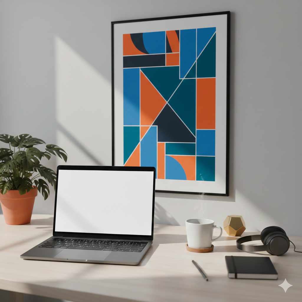
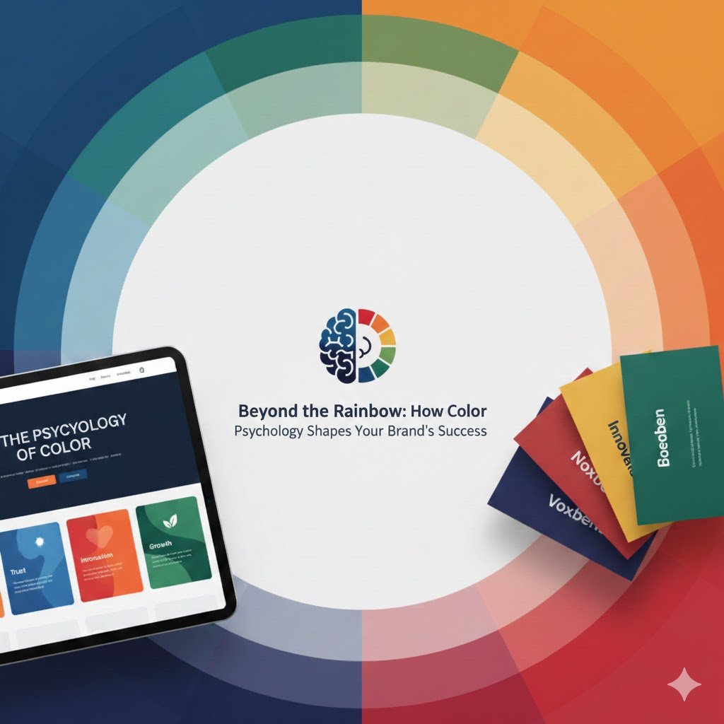
The world of web design is constantly evolving, and the latest catalyst for change is undoubtedly Artificial Intelligence. Far from replacing human creativity, AI is emerging as a powerful co-pilot, empowering designers to streamline workflows, personalize experiences, and bring visionary concepts to life with unprecedented efficiency.

As someone who navigates both language learning with AI (like Aappo!) and the practicalities of business development, I’ve seen firsthand how intelligent tools can transform complex tasks. Web design is no different. Let’s explore how AI is fundamentally reshaping how we build the digital world.

1. Generative Layouts: From Concept to Wireframe in Minutes

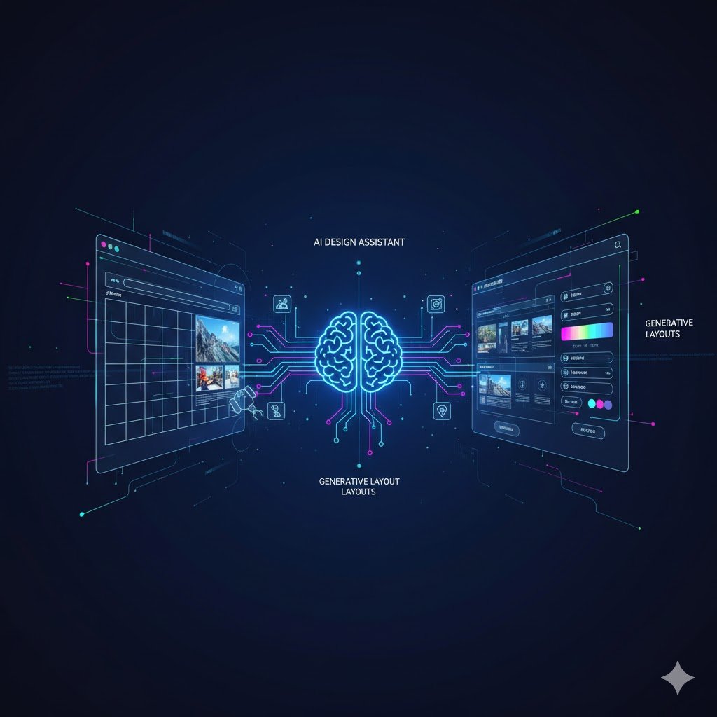
One of the most exciting applications of AI in web design is its ability to generate layouts and wireframes. Imagine providing an AI with your project requirements – target audience, brand colors, desired functionalities – and instantly receiving multiple design options.

(Refer to the left side of the image with “Generative Layouts” and grid structures)

This isn’t just about saving time on repetitive tasks; it’s about breaking through creative blocks. AI can offer novel structural ideas that a human designer might not immediately consider, providing a diverse starting point for further refinement. It allows designers to spend less time on basic scaffolding and more time on high-level strategic and creative thinking.

2. Intelligent Design Assistants: Your AI Co-Pilot

Beyond generating full layouts, AI acts as an invaluable design assistant, handling numerous intricate details. These tools can analyze user data to suggest optimal button placements, font pairings, and color palettes that resonate with your audience.

(Refer to the central “AI Design Assistant” brain with glowing circuits connecting elements)

Think about the sheer volume of choices involved in a single web page. An AI assistant can:

  • Optimize UI Elements: Recommend sizes and positions for interactive elements to improve user experience.

  • Ensure Consistency: Maintain brand guidelines across hundreds of pages, ensuring a cohesive look and feel.

  • Automate A/B Testing: Quickly test different design variations to see which performs best, taking the guesswork out of optimization.

3. Personalized User Experiences: The Dynamic Web

Perhaps the most impactful application of AI is in creating truly personalized user experiences. AI can analyze individual user behavior, preferences, and demographics to dynamically adapt website content, layout, and even calls-to-action in real-time.

(Refer to the right side of the image with “Generative Layouts” on a design panel, showing colors and interactive elements)

For businesses, this means:

  • Higher Conversion Rates: Presenting users with exactly what they’re looking for, tailored to their journey.

  • Increased Engagement: Keeping users on your site longer with relevant and appealing content.

  • Smarter E-commerce: AI can power recommendation engines that suggest products based on browsing history, leading to more sales.

The Human Touch Remains Paramount

It’s crucial to remember that AI is a tool, not a replacement for human creativity, empathy, and strategic insight. The best web designs will always be a collaboration between an intelligent machine and a visionary human. AI handles the heavy lifting, the data analysis, and the rapid prototyping, while designers bring the unique vision, cultural understanding, and emotional resonance that only a human can provide.

As we move forward, mastering AI tools in web design will become an essential skill, allowing us to build more intuitive, efficient, and breathtaking digital experiences than ever before.